Today, I want to talk about how you can create a mobile responsive web page, particularly a resources page, for your website without having to know any code. That’s really a big statement a lot of these page builders try to make when trying to build anything that has a great look, feel, and design.
But one product that I’ve been really, really getting my hands dirty with is Thrive Architect.
What is Thrive Architect?
Thrive Architect is a visual web page builder that is focused on ease of use for business websites.
I do have some HTML and CSS coding chops, but I’m definitely not an expert. This plug-in has helped me save a lot of time, especially when it comes to creating my resources page.
For your resources page, you’re going to want to have some recommendations for your target audience. I did branding and technology, and so, I’ve got a couple of different recommendations and offers for my audience. I’m putting some trusted tools and links on my resources page, and I’m building it in Thrive Architect.
Watch the video:
How did my old resources web page look like?
My old resources page looked like this:
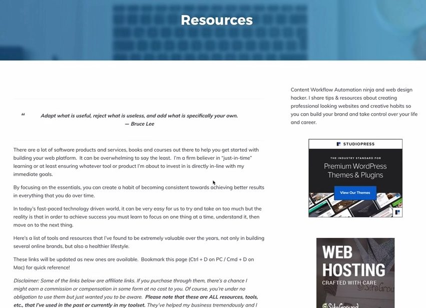
It’s a typical WordPress two-column layout with the information on one side and then a side bar on the right with some banner ads or links. It doesn’t really look that great, especially when you resize it. I want to resize it, but when I do, all the sidebar stuff goes to the bottom of the page. From a user experience perspective, it’s not mobile-friendly. There’s a disconnect in the continuity and flow of your reading experience on mobile. Also, it doesn’t look catchy and appealing.
Using Thrive Architect on my development site, I am going to put together a one-resource-item row that you can see with a button and it’s mobile-responsive.
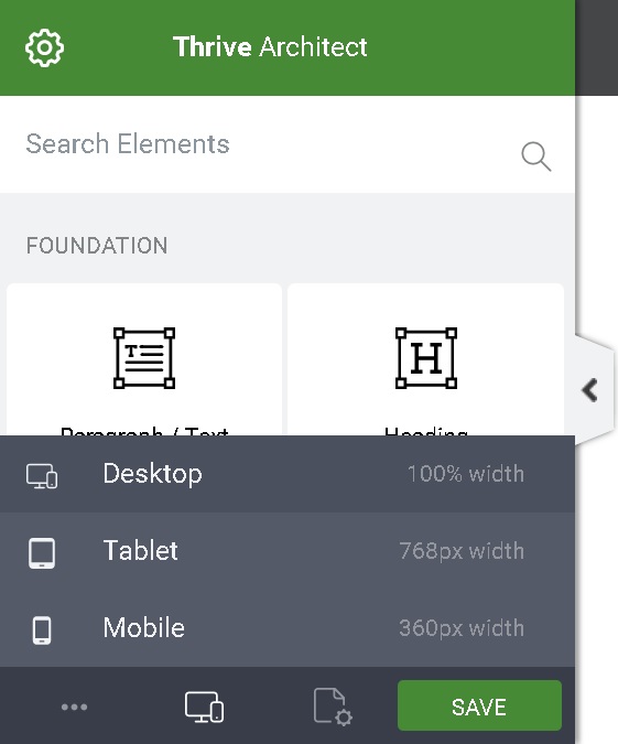
How can Thrive Architect help you create web pages?
It has Responsive View which automatically adjusts your web page for mobile and tablet
In Thrive Architect, when you click on the responsive view button at the bottom, you’ll have three different views – desktop, tablet, or mobile. You don’t really have to know what size the tablet is or mobile and you can toggle back and forth.
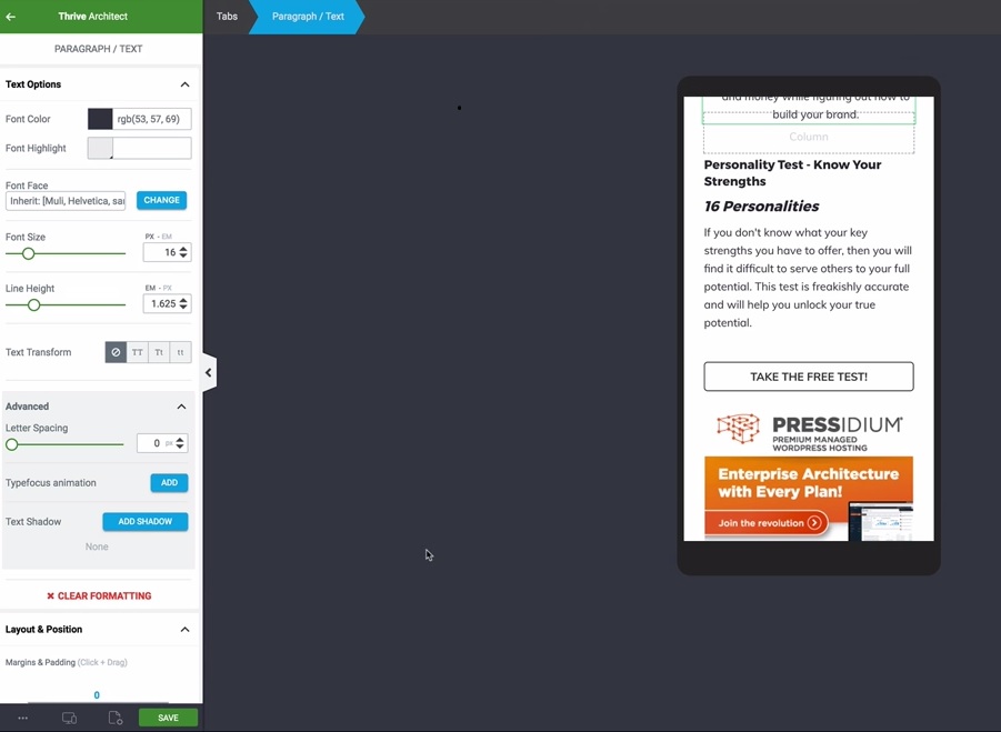
Let’s say I make changes while in desktop view. If I go ahead and toggle between the tablet and mobile view, it automatically adjusts everything for me. You don’t have to make the changes in each view because it does it for you.
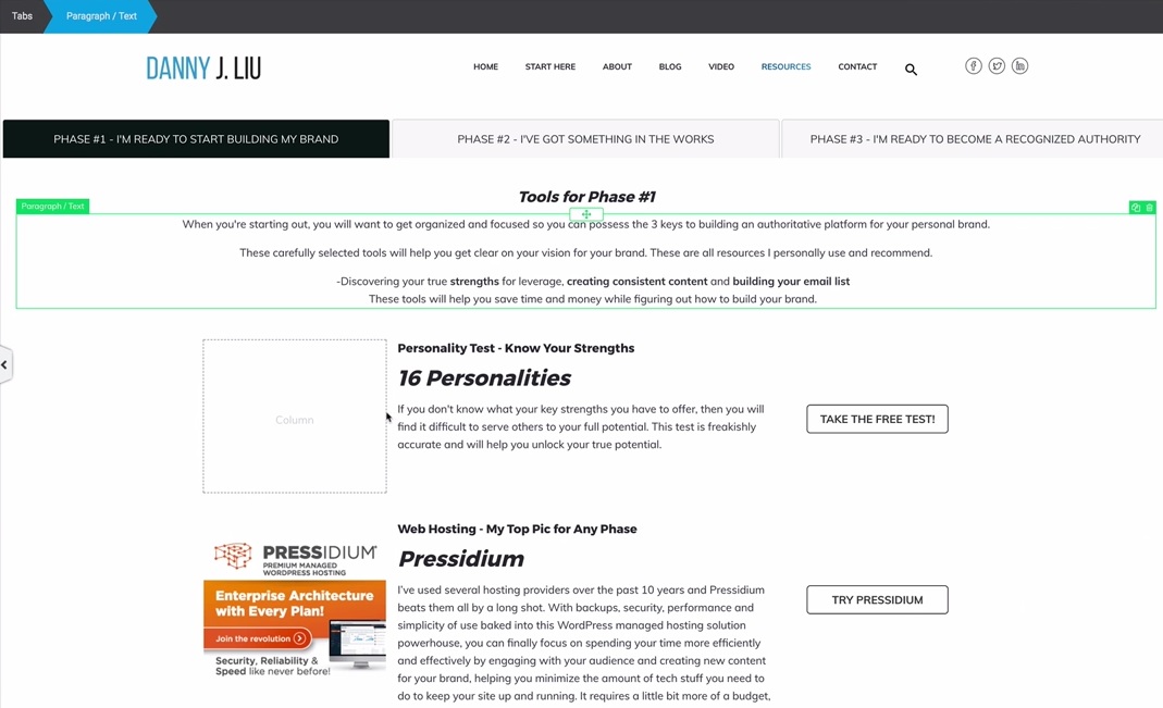
Even in mobile view, the elements are stacking one on top of another. So, I’ve got 16 Personalities test and Pressidium, which I use for hosting, and it’s an awesome host by the way. Now, with each resource in mobile view, the image is on top, followed by the description, and the button at the bottom.
You can easily adjust various elements in your web page
My resources page is a work in progress, and now, I want to adjust and resize the buttons on my web page.
With Thrive Architect, you don’t even need to know how to use CSS or HTML to get this job done whereas if you didn’t have this, you’d be probably having to copy some code snippets or hire an expert. It’s not necessarily all that difficult once you get the hang of it, but there is a learning curve to all of that.
Now, if I click on the button on my web page that I want to edit, it will activate a panel on the left side where various options for customization appear.
For example, I want to change the button size to 210 pixels. I can easily do that by typing that in or using the slider to set the button size.
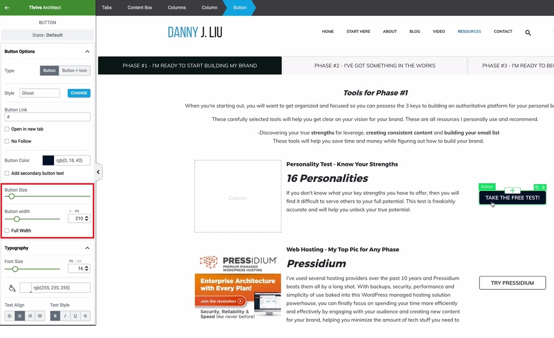
All I had to do was type the number in for the button width. You can drag and drop it using the slider. I prefer to be a little bit more precise. That’s just me. Once that’s set, you’re going to hit save, and that’s it. Now, you’ve got a nice responsive button for the desktop, tablet, and mobile views.
What if I’m not good with designing web pages?
You don’t have to be an expert designer. This is actually not completely my idea for the design and the layout. You can use other people’s websites that you follow for inspiration. I have to give credit to Amy Porterfield because her resources page is what got me inspired to design this using Thrive Architect.
But, I’m going to add my own design and flair to it because that’s what personal branding is all about. Don’t just be ripping off someone’s content word for word. You want to be branding yourself.
You don’t have to be an expert designer to be able to put together some decent designs. Use some inspiration. Just like what a quote from Bruce Lee says, “Adapt what is useful, reject what is useless, and add what is specifically your own.”
There’s a lot of things out there that you can use and adapt into your own workflow and your own brand without losing your genuineness. You’re unique and what you bring to the table is going to show in the work that you do just by nature.
To summarize, the advantages of using Thrive Architect in creating web pages are…
#1-You only have to edit a web page once for all the different views
For each of the views- desktop, tablet, and mobile- all you have to do is be in one view and make the changes and it adjusts it for the other views.
#2-You don’t need to know how to use CSS and media queries
I can’t overstate this enough. This is an awesome tool because if you were to do this without a tool like Thrive Architect, you would have to get messy into the CSS style sheets.
CSS style sheets are the actual sheets that are used for design. Basically, when you’re using style sheets, you have to put something together called media queries. Media queries are break points in your display that will change the complete layout of your screen based on different rules. So, unless you know how to use CSS and media queries, it’s going to be a little difficult.
#3-You save time creating web pages
Now, I know how to use media queries, but here’s the thing, I don’t have the time or the extra 15-30 minutes to sit there and try to set up all of the media queries and everything else on a per page basis.
For designers or professionals at that, there’s other tools and tips and tricks that they use, but again, if you’re focused on your strengths and you’re not focusing on your weaknesses, you’re not going to need to worry about that because you’re going have a tool like Thrive Architect that’s going to do all that heavy lifting for you.
In fact, I am handing this off to my virtual assistant, so she can do some of this when I’m off at work. I work a 9-to-5 job. I just love doing this stuff on the side, and I’ve been doing branding for several years now. This stuff excites me, but also being able to use my time wisely, focus, and prioritize is very important as well.
For everyone looking to build their website, Thrive Architect is out there. Give it a shot.
Check it out and just let me know what you think in the comments below. I’d love to hear from you. 😊
Thanks for the thrive architecture guide. I am currently using it on my blog, but my biggest problem is that it’s jumping the mobile viewport
You’re welcome. Thanks for the comment. Are you referring to content boxes going beyond your mobile screen width? Please drop a link if you’re still having an issue.